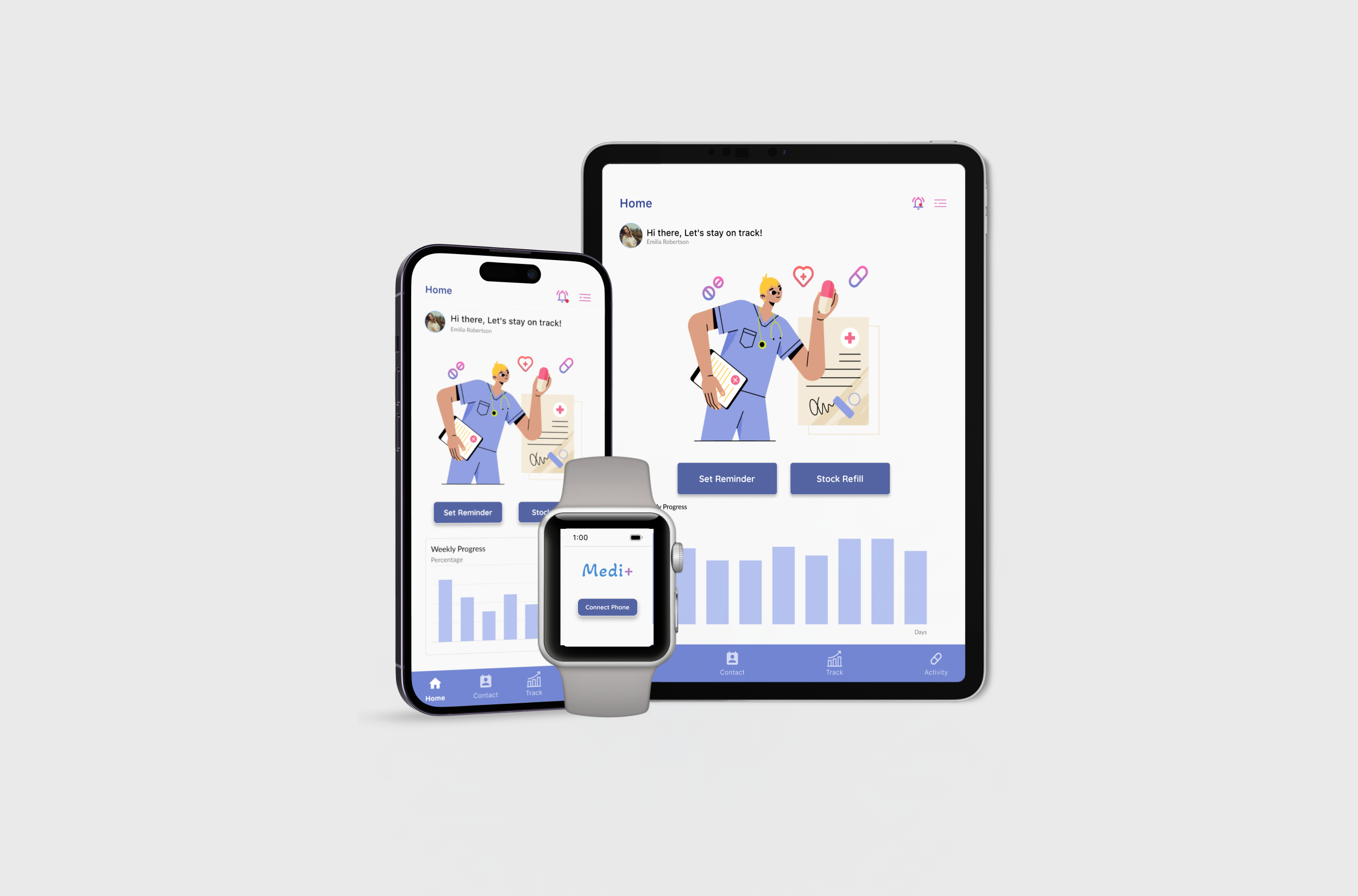
Medi+ is a user-centric healthcare management application developed as part of my Google UX course that addresses a wide range of healthcare demands. This case study explores the design process, challenges, and solutions involved in creating a user-centric healthcare management application. It empowers users to take control of their well-being with personalized features, ensuring that healthcare management is as seamless and user-centric as possible.
In today's complex healthcare landscape, individuals face challenges in managing their health effectively. From remembering medication schedules to tracking progress and accessing relevant resources, there's a clear need for a user-centric healthcare solution that streamlines the healthcare management journey.
Empower users to effortlessly manage their medication, track their health progress, and access valuable resources, making healthcare management accessible and efficient.
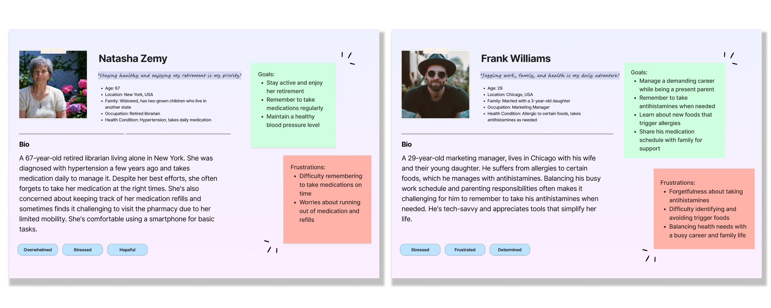
User research was conducted to gain insights into the target user groups and their healthcare needs. Through interviews and empathy maps, i identified primary user groups and uncovered essential insights that guided the design process.
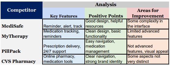
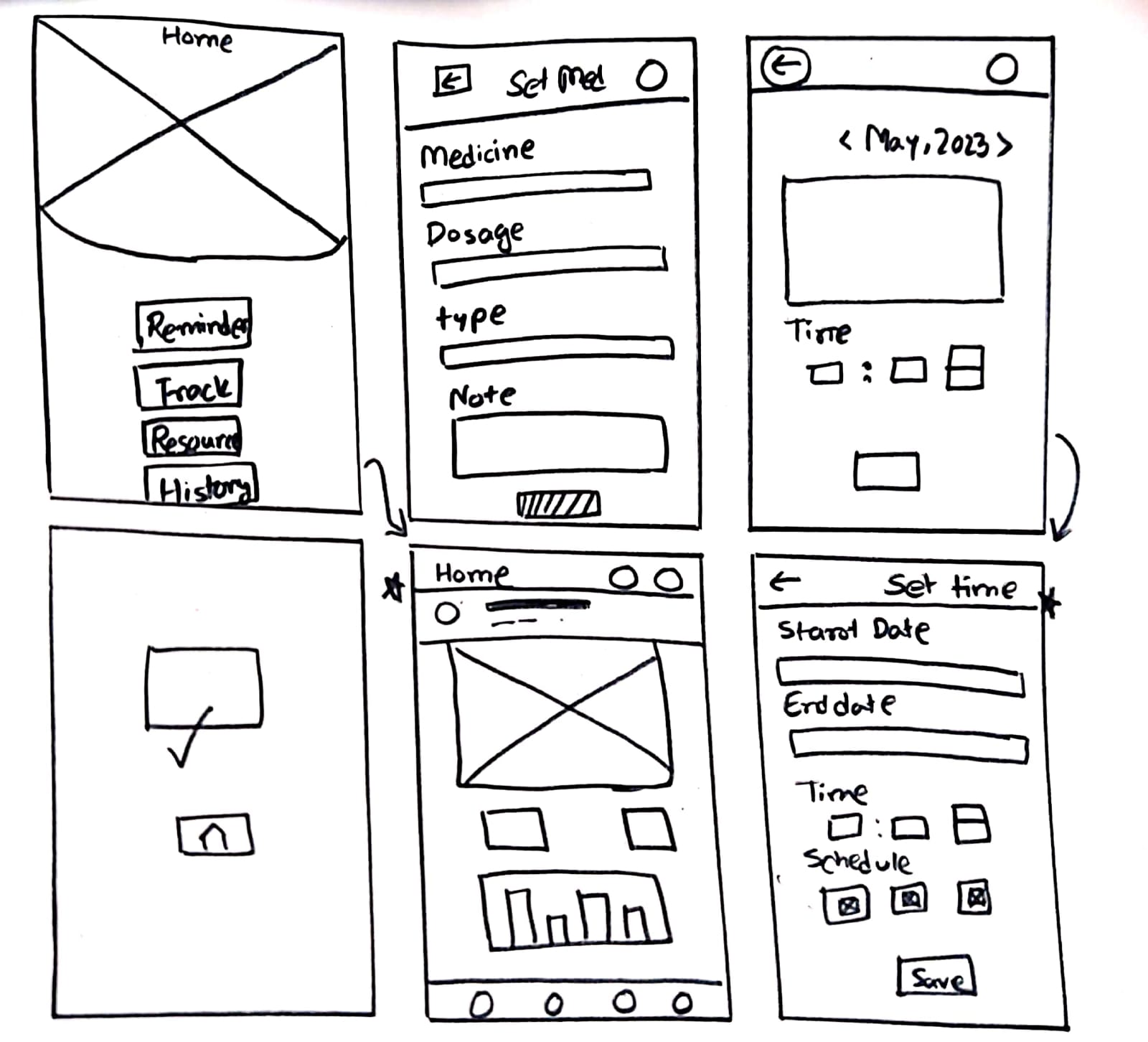
Throughout the ideation phase of Medi+, the spotlight was on optimizing the medication scheduling and tracking functionality. The main goal was to create a user-friendly tool that makes managing medicine really easy, which is a big healthcare challenge.
As we transition from ideation to the digital design phase, Medi+ sets out to transform medication management. The wireframes are tailored to deliver a user-centric interface, simplifying your healthcare journey. These wireframes provide a glimpse into how Medi+ empowers you to proactively manage your health.
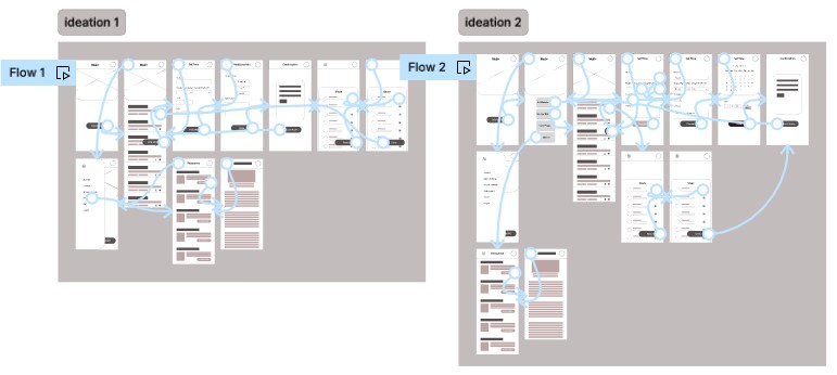
The first iteration of the Medi+ app's low-fidelity prototype introduced core features, including medication reminder setup, educational resources, and contact sharing. It aimed to gather initial user feedback on usability and functionality.
In the second iteration ,improvements were made based on Usability Test 1 findings. This iteration focused on refining the medication reminder setup, enhancing resource exploration, and addressing user feedback to create a more user-friendly experience.
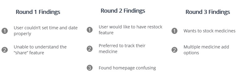
Usability Test highlighted challenges with medication reminder setup, resource exploration, and user understanding of certain features. I conducted a usability study involving 15 participants to gather valuable insights into the user experience of the Medi+ app.
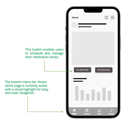
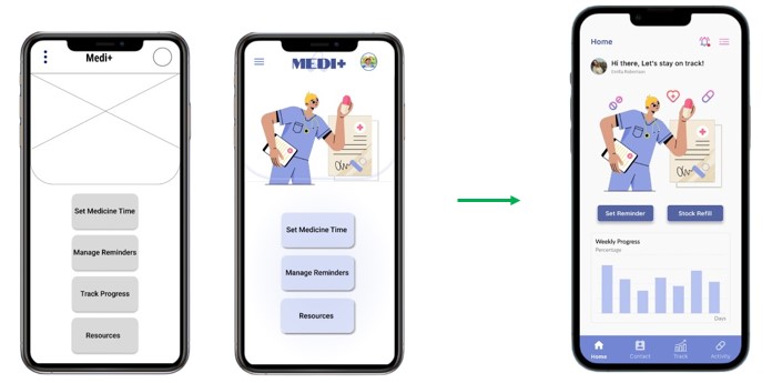
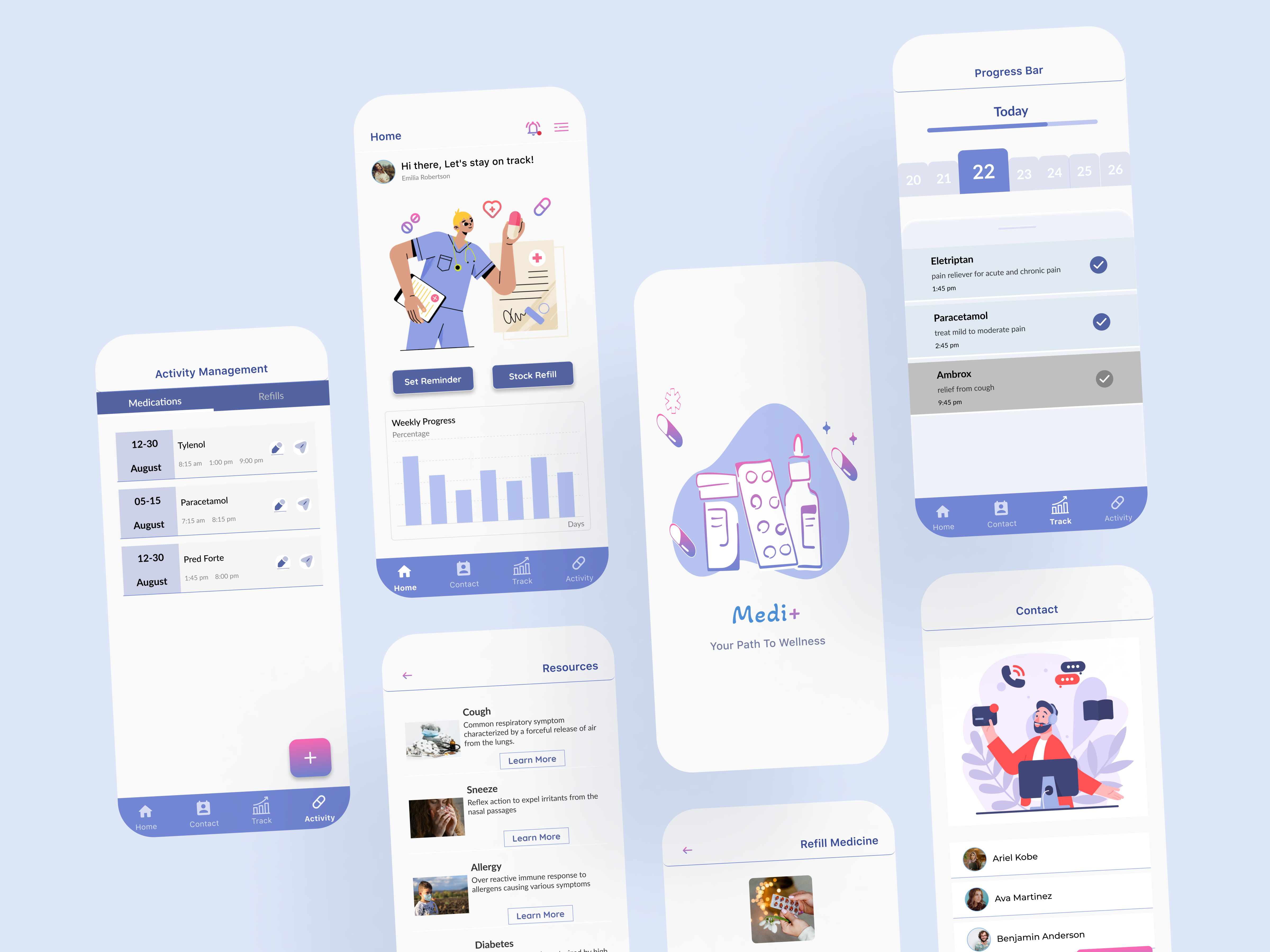
In response to usability feedback from several rounds of testing, the Medi+ app's homepage mockup was improved. The top navigation was streamlined, key buttons for medication management were retained, and a progress graph was added for better insights. The user experience was enhanced with clearer navigation, featuring an active 'Home' icon in the bottom bar.
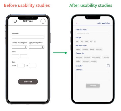
I improved the Medi+ app's "Add Medicine" page mockup. The medication input process was streamlined into two straightforward steps, ensuring a more intuitive and efficient user experience for managing medications within the app.
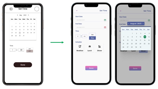
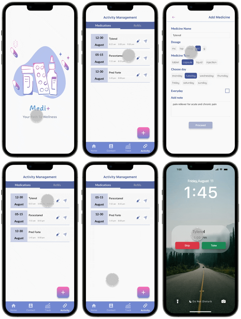
The final high-fidelity prototype for Medi+ represents a significant improvement in user experience. It refines the user flows for setting medication reminders and provides a more intuitive interface. Additionally, it offers advanced customization options and clearer scheduling features, addressing the feedback from earlier rounds of testing.
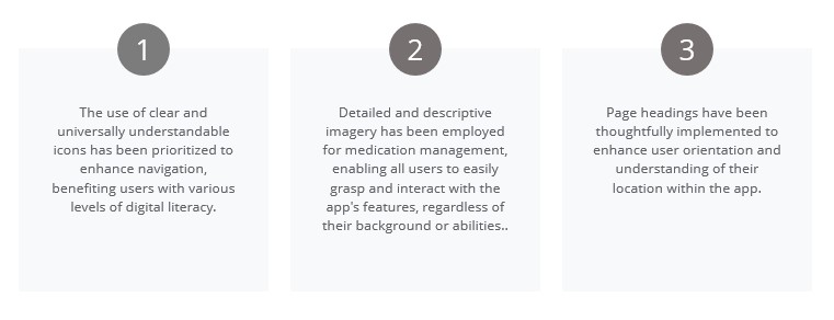
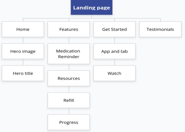
I proceeded to create the responsive website for Medi+. To ensure a coherent and unified user experience across various devices, I referred to the sitemap as a guide for structuring the organizational layout of each webpage. This approach allowed for consistency and ease of navigation, aligning the website's structure with the app's design principles.
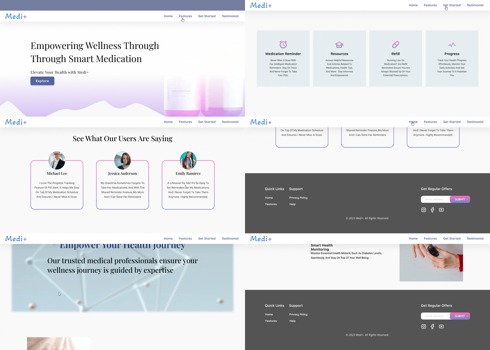
I identified an opportunity to develop an additional online presence that would improve the user experience across all platforms. The website is a helpful tool that allows visitors to learn more about features, access medical information, and read testimonials.
%20Mockup.png)